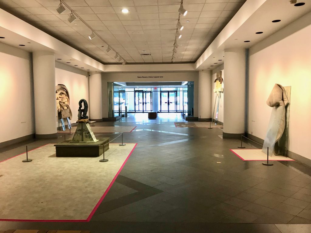
Dave Hardy, Installation View: “Public Setting” west entrance clockwise from left foreground: “Blue Coconut,” (2016) Coconut, glass, cedar, cement, tint, ink, polyurethane foam, vinyl, tape (49 x 25 x 19 3/4 inches) “Destiny,” (2014) glass, cement, polyurethane foam, tint, tape, pen, marker, glue stick, and pretzel (94 x 75 x 8 inches) “Untitled,” (2013) glass, cement, polyurethane foam, paint, tape, pencils, marker, penny, pretzel (120 x 84 x 18 inches) “Swan,” (2014) glass, cement, polyurethane foam, tint, aluminum, tape, pencil, and pretzel (77 x 31 x 14 inches) Photo by Jongho Lee 2017.
Dave Hardy is a Brooklyn-based sculptor known for sculptures made of glass, polyurethane foam often dipped in cement, and other various found and fabricated objects. The sculptures depend on both the fragility and strength of each element in order to balance themselves and the visual tension of the fleshy polyurethane against structural materials like glass only increase the stress of the overall sculpture. Hardy has shown with galleries both in New York and internationally, including Paris and Berlin. His most recent project was an exhibition of his sculptures installed at the Bulova Corporate Center in Elmhurst, Queens, curated by the Queens Museum titled Public Setting. The exhibition was curated by independent curator Alessandra Gomez, coordinated with Sophia Marisa Lucas, Assistant Curator of the Queens Museum. He sat down with Jongho Lee to talk more about this project, as well as his practice.
Jongho: You’ve talked about how much you like the description of how your sculptures sound when you walk into a room. When someone says “sculpture,” the first thing that comes to my mind is an object in a white cube- and with this exhibition at the Bulova center the setting is very different than that of a gallery. Is this the first time for this body of work to be installed in such context? And do the works sound different in this context?
Dave Hardy: Those are my favorite places to work with- places that are not traditional gallery settings.
JH: It feels like they almost belong there.
DH: The work at the Bulova center really does feel like it belongs- it was situated there particularly I was really excited about the idea of installing that floor to ceiling piece in the vacated mini bank- you were there installing and it almost grows up from the floor through the drop ceiling, the acoustic tiles were removed, and then the top of the sculpture is anchored out of sight way above that lowered ceiling and attached to all the inner workings of the building that you don’t see- and there is all of that sound emanating, all that kind of low, almost inaudible hum of a building. Like that building both feels like a living thing, but then there is something also dead about it because it is this corporate setting and there’s something about the suppression in that title, even.
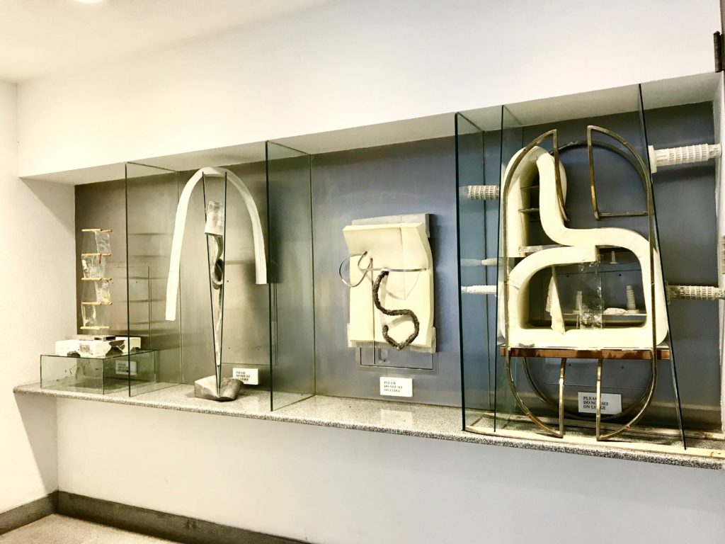
Dave Hardy, Installation view: “Public Setting,” South entrance “Untitled I (Please do not sit on ledge)” (2017) glass, cement, polyurethane foam, metal, tape, tint, wood, salvaged furniture (54 x 38 x 18 inches) “Untitled II (Please do not sit on ledge),” (2017) glass, cement, polyurethane foam, metal (54 x 38 x 18 inches) “Untitled III (Please do not sit on ledge),” (2017) glass, cement, polyurethane foam, metal, tape, wood, pencil, marker (54 x 38 x 18 inches) “Untitled IV (Please do not sit on ledge),” (2017) glass, cement, metal, tape, tint, pretzels, wood (54 x 38 x 18 inches) Image courtesy of the artist, 2017
JH: Can you explain where your pieces are installed in the building?
DH: They are installed in both the west and the south entrance- the south entrance being the one with the phone booths. So the way it happened was; Alessandra Gomez, a really smart awesome curator, got in touch with me and asked me if I would participate in this and we went back and forth. And when she showed me the site, I saw that the designated hallway gallery near the west entrance that had these blonde maple benches that were kind of personality-less and everything just felt airless to me. And I said “Okay, I guess I can do something with this,” and talking to the building manager, as the tour went on, we went and saw another wall that they in mind. And near that was this empty room with these four stainless steel base with glass partitions that I could immediately recognize as a break area that used to have payphones- and I asked him “What’s up with that area?” It wasn’t where they wanted me to put my work, and he said “That’s just where the old payphones were, I’m supposed to wall over that” and so I got permission to install in there, almost like these new occupants of that space. That particular spot is something different than the mechanical aspect of the building – it’s where people go and talk, rather than it being any other part of an office building. And on our way out, I asked where I should stage my crates and packing materials after my sculptures were unpacked, and he told me that there was a tenant that had just left, which was the bank, and that I could put everything there. And it was weird, because it was a tiled room with all of the vestiges of a bank, I could see where the letters had been torn off the wall, and the teller counter was still there, and its red-brown laminate and sort of gold backing for the name and the bank hours were still on there. And as I was driving home, it struck me maybe that they would let me do it in there- so I went back, found the guy and asked “Can I place that piece behind the door in the bank?”
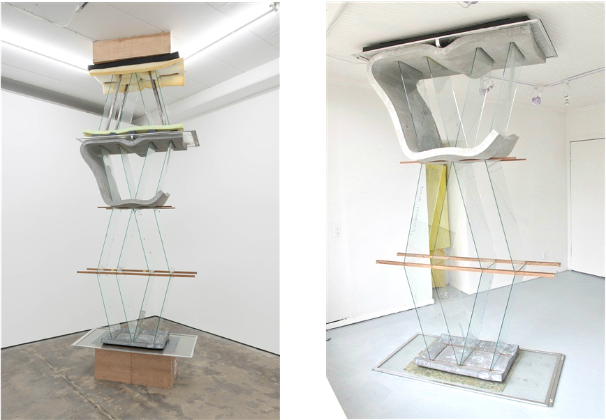
Dave Hardy, “That a Dead Man Sings,” (2014) polyurethane foam, glass, cement, ink, wood, aluminum. Left: Wentrup Gallery, Berlin. Right: 247365 in Brooklyn. Image courtesy of the artist, 2017
JL: And that piece, which is titled That a Dead Man Sings, is varied depending on the height of the installation site?
DH: Sure, effectively it’s been a different piece every time. Because the first time I installed it, I made it for a smaller space in Brooklyn, 247365 where the ceilings were just over eight feet tall. So it was an experiment- I didn’t know if it would really work because it’s an inverted sculpture that kind of follows the form of an endless column, but then it’s really sitting on nothing. There’s this cement-foam kind of grotesque shape atop these glass panes sitting on top of these wooden notches, and it shouldn’t stand because it’s inverted, so it really was just an experiment at this point.
And then, there was another time the piece was shown at Wentrup Gallery in Berlin. I was showing them pictures of my work in my studio and Tina pointed to that one, meaning “that a dead man sings,” and asked for several other pieces, and I was thrilled to have a show in Berlin. And on her way out, I asked “how tall is the ceiling,” and she said “Oh, five meters.” Which meant that I had to add over six feet to a piece that was designed to be sandwiched between the floor and the ceiling as a tension structure because it only works under pressure. So that turned it into this totally different thing.
And then this time in Bulova, the ceiling is even more mystifying because it’s a drop ceiling that you can’t connect anything to. So rather than pressing up against something and feeling sandwiched, it actually carries through the tiles that are removed and just disappears up through into the inner workings.
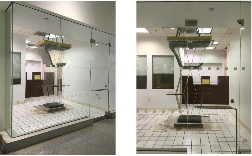
Dave Hardy: “That a Dead Man Sings” (2014) Installation view at Bulova Corporate Center. Image courtesy of the artist, 2017.
JH: I like how it’s anchored instead of sandwiched- and how the piece is now a part of the inner workings of the building
DH:Right, it attaches like vines wrapping around something. Which is funny; I talk to my dad sometimes about where artwork goes as you age as an artist and he’s told me a bunch of times: “Well yeah, and then you put it in the woods, and you watch the vines grow through the sculpture and the leaves fall on them.” And it seems depressing at first, but it’s kind of a great description of how things get swallowed by the Earth again. And it seems similar in that space- these places that are kind of abandoned in the corporate center, and as corny as it sounds, these sculptures feel like they are filling in these spaces, or taking root somehow.
JH: Especially the ones in the phone booth, I remember when you were installing, an older woman walked by and said “there used to be phones there,” not annoyed that the phones were gone, but almost excited that another set of objects were going in.
DH: Right, because that speaks to the history of that building that just gets lost so easily right? That woman used to talk on those phones so she identifies that and people who are in the break area or the snack bar now may not have any relationship to the history of that extremely sanitized space: that it has changed, and that there are personal associations with it that it feels like an effort to erase and make it feel as professional as possible. Those markings, that idea of what went on in that space that is totally lost and a newcomer, is one of the more engaging things for me while installing the work.
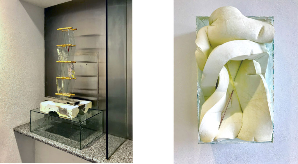
Dave Hardy: Left: “Untitled IV (Please do not sit on ledge),” (2017) glass, cement, metal, tape, tint, pretzels, wood (54 x 38 x 18 inches) Right: “Untitled,” (2016) Polyurethane foam, cement, glass, tint, aluminum, tape, china markers, pen, pencil, (34.5 x 19.75 x 15 inches) Images by Jongho Lee, 2017
JH: Can you talk about the balance between the materials you use? All of the materials that appear a lot, the foam, cement, and glass are all almost invisible especially in the city because they so intertwined and essential that they almost disappear. There’s an aspect of harmony, but also a more forced, violent aspect to the relationships.
DH: The pieces are built around really fragile relationships- and whether it’s the relationship between two bodies, meaning elements of a particular work like a diving board and a thick piece of old glass table top standing facing each other with just something draped over linking them, or whether it’s panes of glass sitting in the notches of a piece of wood, they’re all about creating these dependencies. So the pieces are forced and under tension to just shy of the point of collapse. That’s where they work, you know? If they are forced, pushed, or pressured anymore, the glass could break, the whole thing could collapse, it could fall over.
JH: Does that happen alot?
DH: In my studio. So far, (knocks on wood) its never happened in a public place. That a Dead Man Sing, because it’s behind the closed doors of a bank I feel less worried about it. Because they are really anxiety producing. When I showed it in Berlin, it was at an open gallery.
JH: Were you at the opening?
DH: I was. A lot of times I leave my openings because people get all saucy and decide to really test the sculpture. They’ll play-act running into them and go too far and actually run into them, and the whole thing sways a little bit and makes my stomach drop. But at this point, everything has been fine.
JH: At the bases of your sculptures in the hallway before the bank are the linoleum flooring taken from your own studio. While your sculptures are imposing in the space, the flooring seems to create more of a harmony instead of the tensions seen in the pieces? Even with the pink tape surrounding the linoleum, the flooring looks as if it’s supposed to be there in a weird way, opposed to the tension mentioned before.
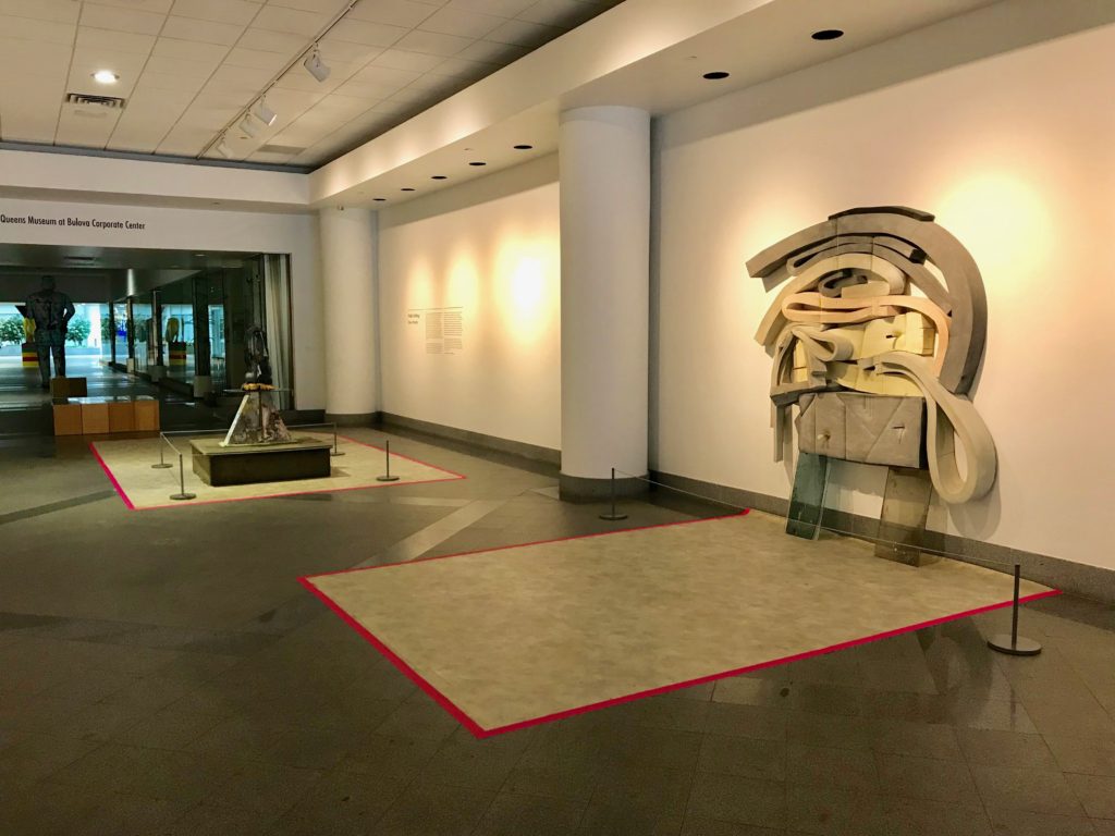
Dave Hardy, Installation View: “Public Setting” west entrance clockwise from left foreground: “Blue Coconut,” (2016) Coconut, glass, cedar, cement, tint, ink, polyurethane foam, vinyl, tape (49 x 25 x 19 3/4 inches) “Destiny,” (2014) glass, cement, polyurethane foam, tint, tape, pen, marker, glue stick, and pretzel (94 x 75 x 8 inches) Image by Jongho Lee, 2017
DH: That’s funny- I think the opposite.
JH: I guess that’s the question, is it a harmony or a tension?
DH: I think it’s an opposition. That space in one sense tries to create uniformity throughout and those pieces of marked-up, dirty linoleum that are scattered underneath the sculptures feel like they’re really breaking that uniformity up to me. Because they’re not in a particular pattern and they tie the work into the room maybe? But I don’t think of them necessarily as creating a particular comfort or anything. They are owning the space below them in a way- and rather than sort of sitting on bare floor, they continue to be a part of that floor. That idea of how work meets the room, I like having them on their own islands to start with. So it is kind of a connective tissue, but it’s also something that’s really different from the visual purpose of that building.
JH: I really like the linoleum as is too- I like the idea of them acting as islands as you said and also as a setting that the sculptures can be comfortable in outside the studio in a new place. I also can’t help but seeing them as paintings- do you ever think about them as paintings?
DH: Yes- They point back to the process of where and how the sculptures are made, because the linoleum is the surface on which I do the cement work, it’s where it slops off the work and makes these images or marks and I did a solo show with Regina Rex where I had a white linoleum floor and made these racks that were almost like carpet racks, where the linoleum was hung on the walls. And they were kind of like paintings, but kind of like carpets in a carpet store- hovering in that here nor there purgatory. For that show, I the floors were on the wall and I painted the floor of the gallery a bright white, and then the lights were fluorescent. That was where Jonah Groeneboer talked about hearing the sculptures and there being a high pitched whine to them, because it felt disorienting to walk in like a Stanley Kubrick movie or something. It was bright white, and the sculptures were glass and clear with these things stuck in them so they looked like they were almost floating, and it took a minute for my eyes to adjust. So it was a little bit of a visual assault and an acclimation to the way the work looked.
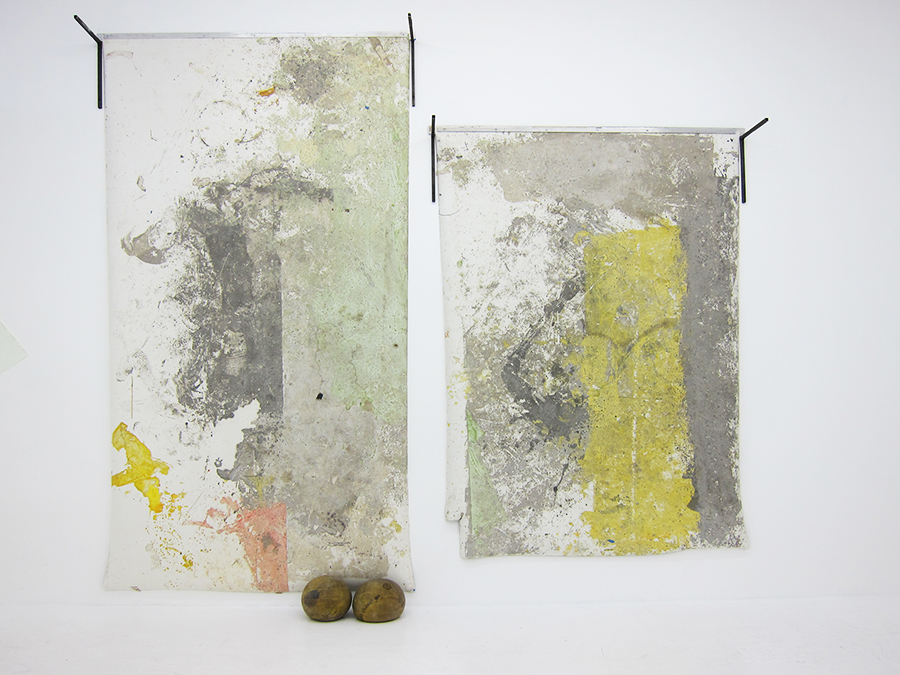
Dave Hardy, Installation view: DAVE HARDY: A HOUSE WITH GATES at Regina Rex Left: Untitled 2 (2013) vinyl, cement, ink, paint, dye, tape, aluminum, steel, exercise balls, 138 x 76 x 14 inches Untitled 3 (2013) vinyl, cement, ink, paint, dye, tape, aluminum, steel, 104 x 76 x 10 inches. Images courtesy of Regina Rex, 2014
JH: The idea of visual assault goes back to the tension you talked about before about pushing each element just to the brink of collapse, and how each of these elements are under this torture caused by a sort of finessed violence, and then left to stay that way for permanence.
DH: I think that’s true, the way that the glass intersects with the polyurethane and cement, feels very cutting. And it does feel tortured, or prodded or poked, or manipulated in a way that really stretches it to its limit.
JH: And then there are moments of comic relief with highlighters and pretzels that are poked into the foam and lean on the glass. Is that meant to be a visual resting point in the sculptures?
DH: They break up that feeling of tension for me. They are also reminders of “here and now” almost like a marker of that moment in time, that I was in here. I don’t really eat pretzels that often but it feels like an immediate impulse that you would want this banal everyday snack food- or a crappy pen. So they end up being these little elements that break up the heaviness of the sculptures and be something else.
JH: Is there a piece that you can think of that significantly changed the direction of your work? Or even an exhibition, the first time you started using such materials or in terms of just a change in conceptual direction?
DH: I think there are number of them. The first one that did that for me was when I lived in California, it was the first time I really used a found object and its context as the complete work. I pretty much took this giant sign letter housing, which was the shape of a U from a giant Canadian club neon sign that said N but I turned it over.’
JH: How big was it?
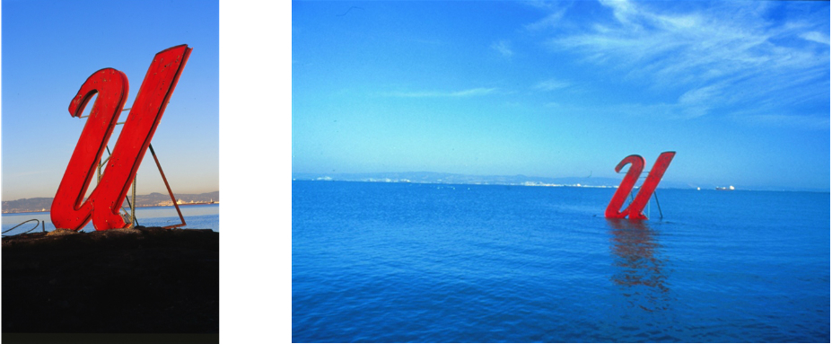
Dave Hardy, U (2001) sign letter, brace, piling, installed in Bay off San Francisco, CA, Images courtesy of the artist, 2017
DH: It was 14 feet tall, and it was made out of steel probably in the 50’s or 60’s. I dragged it home, and I built this brace for it and enlisted a bunch of friends to help me install it in the Bay in between San Francisco and Oakland out on this concrete piling about 100 yards offshore. You could get to it when the tide was out, so we concrete anchored it into this piling and it stood out there and when the tide came in, it appeared to float on the water way offshore like some kind of beckoning figure or floating letter. It was the first time that I let myself not be totally hung up on making or building or fabricating all the parts and just let the object and whatever it brings be the sculpture.
JH: What year was this?
DH: 2001, right before I moved out to New York.
JH: It’s a crazy to even think to look at a sign that cumbersome and say “I’m gonna drag this home”
DH: It was much more of an undertaking than I ever thought it would be and I kind of had to break into city property to get access because it was just off this abandoned park where the bus graveyard for the city.
JH: Is it still there?
DH: No, it was there for a year and was taken out by El Niño. And I went and collected it again, and installed it again. You could still tell what it was, but it was much more crumbled from being tossed around but no, it isn’t there anymore. And in 2008 I was in a three person show in Jack Shainman where I built a floor to ceiling piece using polyurethane foam elements in between these cast coffee tables that created kind of a column that was wiggly and created this weird pattern as it went up, and that was the first time I built a piece using these materials and really played with how it pressed up against the building, and how it depended on it in a way that was unsettling.
JH: Is artmaking a choice for you?
DH: Yeah, every time. I feel like in many ways it’s a need but it’s also a choice, because it isn’t easy, right? There’s a lot of time spent alone without acknowledgement so there’s plenty of time to wonder why you’re doing it and then there is some kind of hard to locate the drive to continue doing that. And whether that’s curiosity, or just wanting to know what will happen if you do a certain thing, what will result from a particular type of behavior, that’s enough to make me continue to make work. The question about making work in the midst of all these real life chrises is such an impossible one in many ways. And I think for me, that’s where a lot of the teaching comes in because at best you’re helping give people the agency to make these choices and be able to make anything or build anything or think about different ways of addressing or communicating their ideas and basically learn a new language that may not be verbal. So it is a hopeful enterprise in a lot of ways- for me at least.
JH: I think that’s it- thank you so much!
DH: Thank you!
Dave Hardy (b. 1969, Sharon, CT) received his MFA from The Yale School of Art in 2004, his BA from Brown University in 1992, and studied at The Skowhegan School of Painting. He has exhibited in group shows including Make it Now: New Sculpture in New York (The Sculpture Center, NY, 2005), Greater New York (MoMA PS1, NY, 2005), and Un Balance (Jack Shainman Gallery, NY, 2008). He has been featured in solo exhibitions at Churner and Churner, NY; Regina Rex, NY; Wentrup Gallery, Berlin; Skibum MacArthur, Los Angeles and most recently at Galerie Christophe Gaillard, Paris. Hardy lives and works in Brooklyn, New York.
This exhibition is curated by Alessandra Gomez, independent curator, and coordinated with Sophia Marisa Lucas, Assistant Curator, Queens Museum
Dave Hardy: Public Setting opened on August 9th and is up until December 15th, 2017 at the Bulova Corporate Center.
